Read any great piece of investment literature and one theme you're bound to come across is, "The best way to maximize market profits is to identify the direction of the primary trend and position yourself with it, not against it".
When developing and building upon a large data set that can train artificial intelligence, one must look high and low across sentiment, technicals, and fundamentals for morsels of data to test hypotheses against. Some argue the efficacy of technical analysis has diminished over the years as its practice at an advanced level has been made more ubiquitous thanks to technological advancements - I think this is true. However, fundamentals are what make charts, not the other way around. And chart analysis can be very revealing when viewed holistically, despite its utility as a daily trading mechanism diminishing.
In this post I'm going to look at five of my favourite charts that I think are good indicators of analyzing the long term trend and prospects for gold. Weekly and daily trading is another matter.
Chart 1: Gold, Quarterly, Logarithmic Scale. 1996-2017
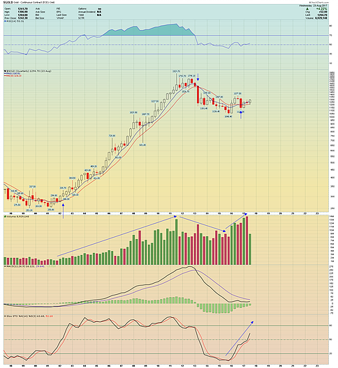
There are a few noteworthy observations on this chart:
- Each bar on this chart represents one full quarter (3 months) of trading. Supplementing this chart is the 6-Quarter and 10-Quarter moving averages. These averages have been very excellent indicators of trend going back even further than this chart shows. There have been three crossovers of the 6 and the 10 quarter averages going back 20 years, indicated by the blue arrows. The most recent crossover occurred in the fourth quarter of 2016. This is supportive of a bullish thesis and suggests the primary uptrend that started in 2001 has resumed in earnest. Another factor that lends clout to the 6 month moving average is that even during the 2008 financial crash there was not a quarterly close below it, despite it being temporarily breached.
- The slow stochastic oscillator at the bottom of the chart is not only rising but the faster moving average within it (the black line) is accelerating. The move is also being confirmed by the quarterly RSI breaking above the key 50 level. MACD has yet to confirm the move but looks like it will later in 2017 or the first have of 2018. MACD is a lagging indicator.
- An accepted technical principle of volume analysis is that volume rises during bull markets and also rises during bear markets. Volume diminishes during corrections and consolidations. It's hard to notice when the focus is daily and weekly charts, but on a quarterly basis the move down from 2012-2015, from a volume perspective, has the DNA of a bull market correction. Volume has resumed its uptrend since the fourth quarter of 2015, supporting the bullish thesis.
Now let's zoom in incrementally and look at the monthly chart for Gold.
Chart 2: Gold, Monthly, Standard Scale. 2007-2017
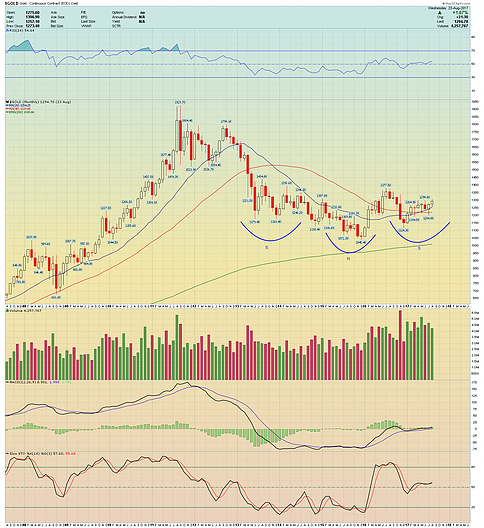
There are a few noteworthy observations on this chart:
- On a monthly scale it is easy to see the head and shoulders basing formation that has been forming since the precipitous fall of April 2013.
- It is a generally accepted principle of technical analysis that the time duration spent in any basing or consolidation formation will amplify the magnitude of the breakout move that follows, whether up or down. This is a significant basing formation with clear technical characteristics. If it is confirmed by a breakout to the upside this chart will likely be used in future financial textbooks as one of the greatest basing formations of all time. It also has a measured upside projection to $1650 should it resolve itself in that manner.
- Supplementing this chart is the 20 and 40 month moving averages, which have been excellent historical indicators of trend. Not even the crash of 2008 was able to put a dent in the collinearity of these trend indicators despite the 20 being breached and the 40 being tested. The 20 month MA has once again crossed convincingly above the 40 month MA. If August closes above it, which it looks set to, that will mark 18 monthly closes above the 20 month MA out of 19 months.
- These moves are also being confirmed by the monthly RSI.
Now let's look at the weekly chart for gold going back to 2011.
Chart 3: Gold, Weekly, Standard Scale. 2011-2017
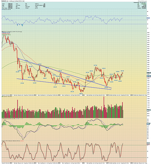
There are a few noteworthy observations on this chart:
- This chart highlights the enormous bull wedge pattern that formed in gold starting with the April 2013 sell-off. There was a false break-down from this pattern in the second half of 2015 which culminated in the prevailing low (and what I would argue is the ultimate bear market low, for many reasons).
- Gold then proceeded to break out from that wedge, convincingly, to the upside.
- It's a generally accepted principle of technical analysis that when price breaks from a wedge pattern, it is common and healthy for the price to test the apex (or convergent point) of the formation that it just broke from.
- You can see on this chart that gold successfully tested the apex of the formation in December of 2016, then bounced off to begin the move we're in today.
- It's my opinion that any further sell-offs over the next two quarters will just further broaden the technical formations we're seeing on the monthly chart and should be viewed as long term accumulation opportunities.
Now let's look at the XAU/GOLD Ratio Chart. The XAU is a cap-weighted index of gold and silver miners that may or may not be engaged in hedging activities, unlike the HUI index.
Chart 4: XAU/GOLD, Monthly, Log Scale. 1992-2017
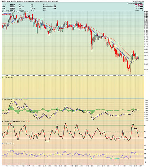
- This chart is the value of the XAU index divided by the gold price. When the chart is rising, XAU is outperforming Gold. When it is falling Gold is outperforming the XAU.
- XAU has been entrenched in a bear market against gold since the mid nineties. That bear market seems to have ended in 2016.
- There are those that speculate the outperformance of gold with respect to the mining stocks was a sentimental indicator. Personally, I believe it has more to due with the lack of significant discoveries, lack of new mines with high ore grades, and a projected decline in production by large seniors being priced into the market.
- The value of mining stocks with respect to the commodity they mine is a function of both the quantity/quality of viable deposits as well as market expectations on the direction of the price of the commodity.
- For whatever reason, market perceptions have shifted dramatically in favour of mining stocks. This could be the market pricing in expected higher prices for precious metals which will make lower grade deposits much more profitable than at current levels.
- There have also been significant discoveries like the Seabridge KSM discovery and the recent developments in the Purdy Reward region in Western Australia which could replenish the future high grade ore production pipeline of the industry above current levels.
- In any case, the XAU/GOLD ratio is firmly above the moving averages that have contained it during the last bear market. From a technical perspective, it too is forming the right shoulder of a potentially significant head and shoulders bottoming formation that could see this ratio mean-revert back levels not seen since the early 2000's.
Now let's look at the last chart.
Chart 5: SPX/GOLD, Quarterly, Standard Scale. 1997-2017
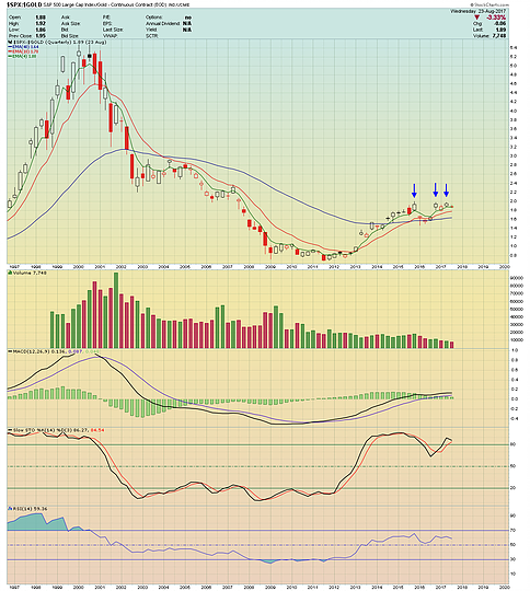
- This is also a ratio chart. This is a quarterly chart of the S&P 500 Index divided by the gold price. A falling ratio means that Gold is outperforming the S&P 500. A rising ratio means the S&P 500 is outperforming Gold.
- On a quarterly basis, this ratio has made a triple top against the 2.0 level.
- On a technical basis, triple tops are very significant. If this ratio breaks down from these levels, confirming the triple top, then it portends significant gold price outperformance over the S&P 500. (Note that a falling ratio doesn't necessarily mean a rising price of one or a falling price of another. Ratios can resolve themselves in multiple ways).
- Further support to the triple top comes from the simple fact that the S&P 500 is at the highs of one of the longest and largest bull markets of all time. Odds favour a cyclical bear market sooner rather than later. At the same time, gold appears to be moving out of one the sharpest bear markets (or bull market corrections) in its past.
- Another significant observation is how much the S&P 500 has declined with respect to gold since 2001, despite its elite bull market since 2009. Despite making new highs in nominal, $USD terms, it appears to be entrenched in a secular bear market in real terms, priced in gold.
- Also note that S&P 500 volume has been shrinking with respect to Gold volume, indicating growing interest in the Gold asset class versus the S&P 500.
As stated above, fundamentals make charts, not the other way around. There are myriad factors that one could argue are influencing these technical developments but its clear there are fundamental tailwinds supporting the long term trend in the gold price that are manifesting in the charts.
Original source: Vanaurumtech.com
Reproduction, in whole or in part, is authorized as long as it includes all the text hyperlinks and a link back to the original source.
The information contained in this article is for information purposes only and does not constitute investment advice or a recommendation to buy or sell.


