We are familiar with the classic appearance of a long-term chart of the gold price; here, for example, is the one presented on GoldBroker.com:
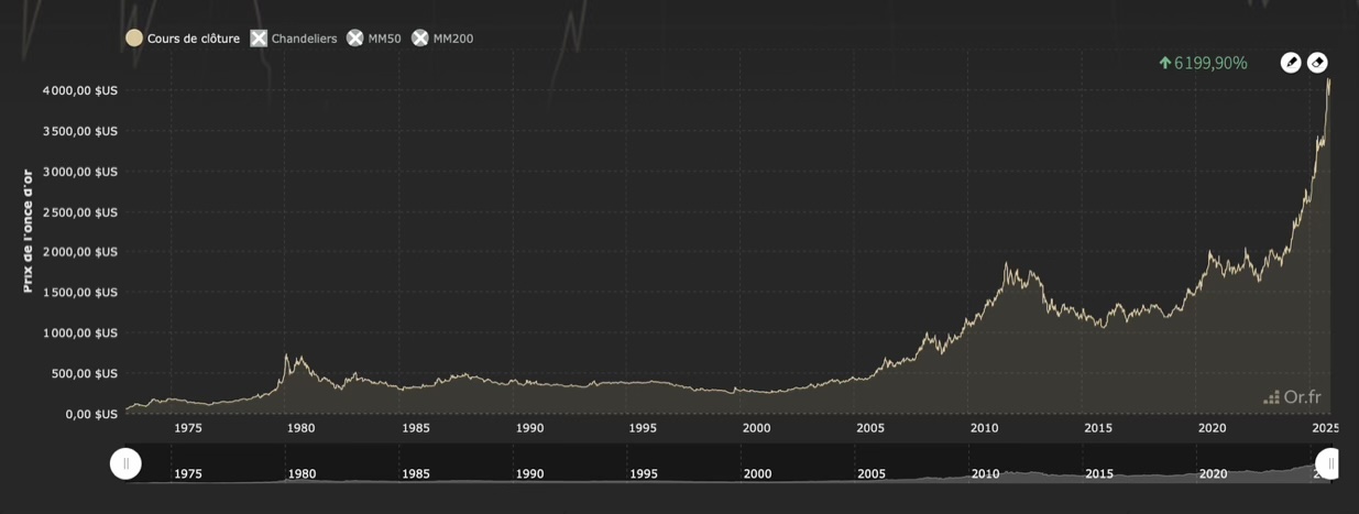
The disadvantage of this representation is that it obscures the values of periods when the price was lower: the recent sharp rise tends to flatten out everything that happened before.
To better understand gold cycles, it is best to use a logarithmic chart. A logarithmic scale allows values belonging to very different orders of magnitude to be represented on the same chart, which is precisely the case for gold. On the y-axis, we can see that the intervals between 30, 300, 3,000, and 30,000 are identical, even though each value is multiplied by ten. The advantage of this is that the cycles of the 1970s are clearly visible.
Strangely enough, I had trouble finding such a chart for gold, even though it is commonly available for bitcoin; it is true that bitcoin has a very visible four-year cycle due to halving. But for gold, it is also very useful:
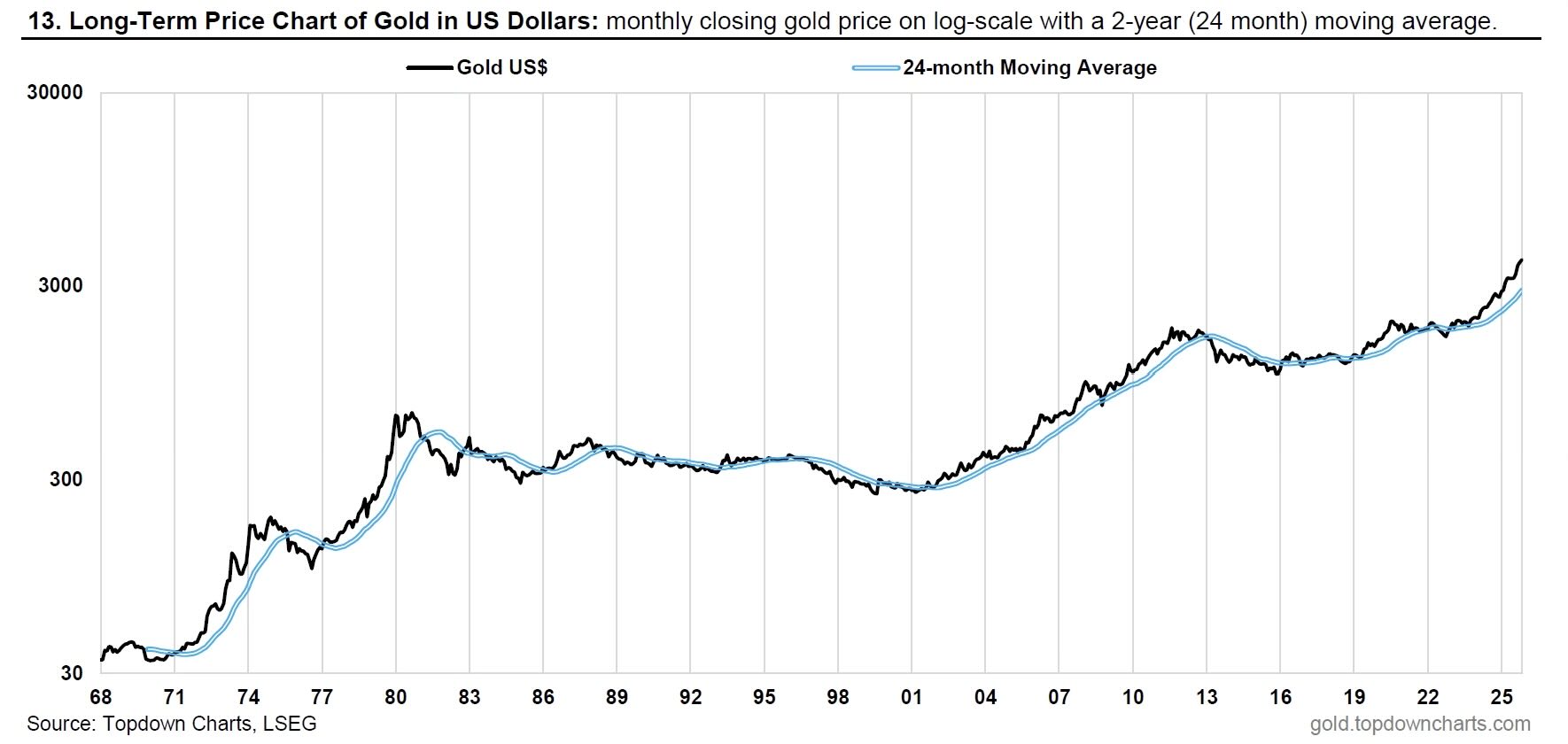
While we may be legitimately impressed by the recent surge in gold prices, which have exceeded $3,000 and then $4,000 per ounce since the beginning of the year, this is ultimately not much compared to the 1970s, which saw much more dramatic movements: the price increased nearly 20-fold over the decade, rising from $35 per ounce to over $600. This year's increase is the most significant since 2000, but it pales in comparison to the two waves of increases that occurred after 1971 and 1977. This means that gold still has upward potential.
The correction of 1980 also stands out for its harshness: Fed Chairman Paul Volcker raised the key interest rate to 20% to combat inflation. The strategy worked, and gold found itself caught off guard. During the 1980s and 1990s, economic growth was strong and budget deficits were contained: gold stagnated at around $300 per ounce. But in the early 2000s, central banks began to manipulate currency: the Fed authoritatively lowered its key interest rate after the bursting of the tech bubble in 2000 and then the attacks of September 11, 2001; the ECB followed suit. This was followed by the subprime mortgage crisis, the Greek crisis, and then Covid... In this context, gold rose in value and protected its holders against inflation, whether it affected consumer goods or assets such as real estate.
The Greek crisis raised fears of an implosion of the eurozone, which ultimately did not happen. From 2012 onwards, gold once again found itself caught off-guard, but it resumed its upward trend in 2019. This is also highlighted by the logarithmic chart: gold rises almost continuously, except when an anticipated scenario is reversed (such as the inflation of the 1970s or fears of the euro breaking up), or when the economy is relatively healthy—as in the 1980s and 1990s, a situation that, given the current level of debt, is unlikely to recur.
Since becoming “free,” gold has risen steadily, with a few exceptions. This is precisely what the logarithmic scale chart shows, and it is particularly encouraging for the future.
Reproduction, in whole or in part, is authorized as long as it includes all the text hyperlinks and a link back to the original source.
The information contained in this article is for information purposes only and does not constitute investment advice or a recommendation to buy or sell.


