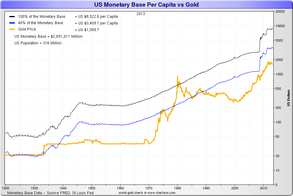
The formula used by Nick Laird came from James Rickards (Read our interview with James Rickards). It's based on the rule they had in place in the early 1900's where the monetary base was backed by 40% gold.
For the formula for this chart Nick Laird take the Monetary Base & divide it by the population & then take 40% of the answer.
So the blue line is the historical 40% backed by gold rule that we were on during the gold standard.
The black line is 100% backed by gold & as can be seen in overshoots it can be pierced.
So the blue line gives us a target & the black line gives us a potential high as gold's value moves back in line with the size of the Monetary Base.
Reproduction, in whole or in part, is authorized as long as it includes all the text hyperlinks and a link back to the original source.
The information contained in this article is for information purposes only and does not constitute investment advice or a recommendation to buy or sell.


