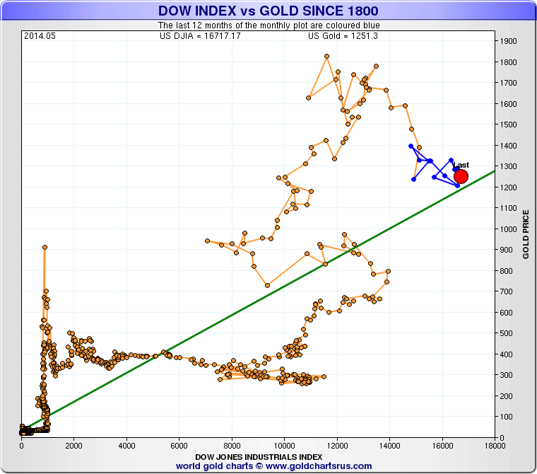
Scatterplot charts showing the relationship between the Dow Industrials Index & Gold for the last 200 years. (A surrogate index is used for the Dow prior to 1896.)
Due to the linear nature of this chart we cannot see the early period shown clearly.
Here's the period from 1800 through to 1900 with gold mainly stable as the Dow advances from left to right.
What stands out is the vertical nature of the gold price at the end of the Civil War.
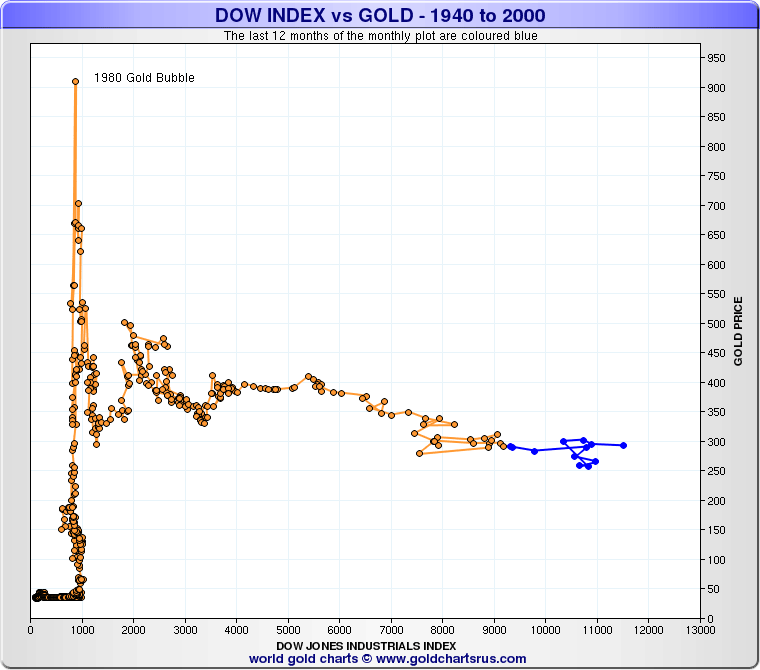
Here's the period from 1900 through to 1970 with gold stable prior to the FRB revaluation in 1933-34.
It then remains stable through the Bretton Woods period with the Dow advancing left to right.
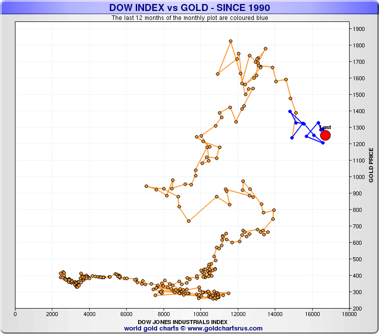
And here's the current picture from 2000 onwards.
As can be seen the gold price was stable the first decade & then rose almost vertical again.
I believe that there's good odds that in 10 years time if we were to look back at the bottom chart again that we would see an almost vertical rise in the price of gold with the Dow backing off in it's growth.
The last few years of QE have stalled the ascent of gold & forced the Dow to move the right but this effect is likely to be reversed going forwards.
Gold has the potential to triple from here & that will leave the bottom chart eerily similar to the other examples of secular rises in the price of gold when the financial engine stalls & the Dow pulls back.
Reproduction, in whole or in part, is authorized as long as it includes all the text hyperlinks and a link back to the original source.
The information contained in this article is for information purposes only and does not constitute investment advice or a recommendation to buy or sell.


