Over the past couple of years, I have shown you numerous ratio charts that suggest a precious metals bull market is in full swing. This week, we will add a couple more into evidence that highlight the sheer magnitude and duration of this magnificent bull.

The first is the ratio of United States Government Debt to Silver and tracks all the way back to the early-1940s. When debt has outperformed Silver, we have generally seen paper assets strongly outperform hard assets. I have defined this chart as a giant rising wedge, and what should immediately stand out is the sharp rise in the ratio from 1980-2000 that mirrored a tremendous bull market in the American stock market. I have also noted two bullish broadening falling wedges in which Silver outperformed debt and resulted in major bull markets for the precious metals.
If we look at the price action of the last decade, we can see it has formed another major consolidation pattern in the form of a broadening wedge. This wedge, however, has broken down sharply and has also pushed price out of the 82-year rising wedge. Within the broadening wedge, we can also note a classic-looking head & shoulders pattern. Given the magnitude of this breakdown, one would expect a precious metals bull market that could likely dwarf what we saw in the 1970s and early-2000s. The significance of an 82-year bearish rising wedge breakdown is almost too big to fathom, and I suspect it will lead the Silver price well into the triple digits.
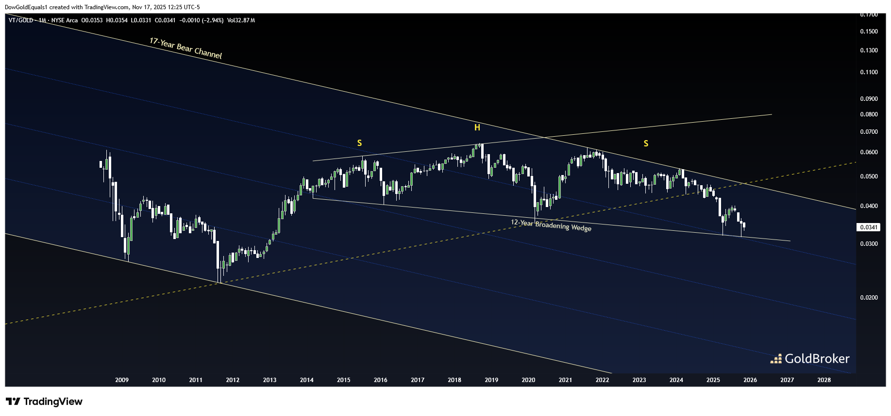
The second chart we will look at is VT/Gold. VT is the Vanguard Total World Stock ETF and the ratio chart highlights that when the Gold price has outperformed (falling ratio), it has been during very strong Gold bull markets. The broadening wedge pattern highlighted should look very familiar to the one shown in USGD/Silver, complete with a very similar head & shoulders pattern. While it has yet to break down, I suspect that is only a matter of time. If and when it does, it should mark the next leg up in the Gold bull market. Given the size of this pattern, that next leg is likely to be a very substantial one.
Reproduction, in whole or in part, is authorized as long as it includes all the text hyperlinks and a link back to the original source.
The information contained in this article is for information purposes only and does not constitute investment advice or a recommendation to buy or sell.


