As gold makes yet another All Time High this week and now sets its sights on $3,000, silver remains in the low-$30s with investors left wondering just if and when the metal will start to move. This week, we'll take a look at a couple of ratio charts that will renew your enthusiasm for silver.

The first chart is a ratio of Silver/Gold, a chart we want to start seeing move higher if silver is to enter a bona fide bull market. As we look at the near 100-year wedge, we see that the ratio is currently sitting on the bottom rail where silver has historically recorded significant lows. Indeed, $32.50 silver today is just as cheap as $3.50 silver was in the 1990s. Note also the false breakout that occurred during the Covid low below $12. A false breakout suggests the next move is likely to be higher. A reversal here and subsequent breakout of the wedge is the key to triple digit silver, an eventuality that I view as likely.
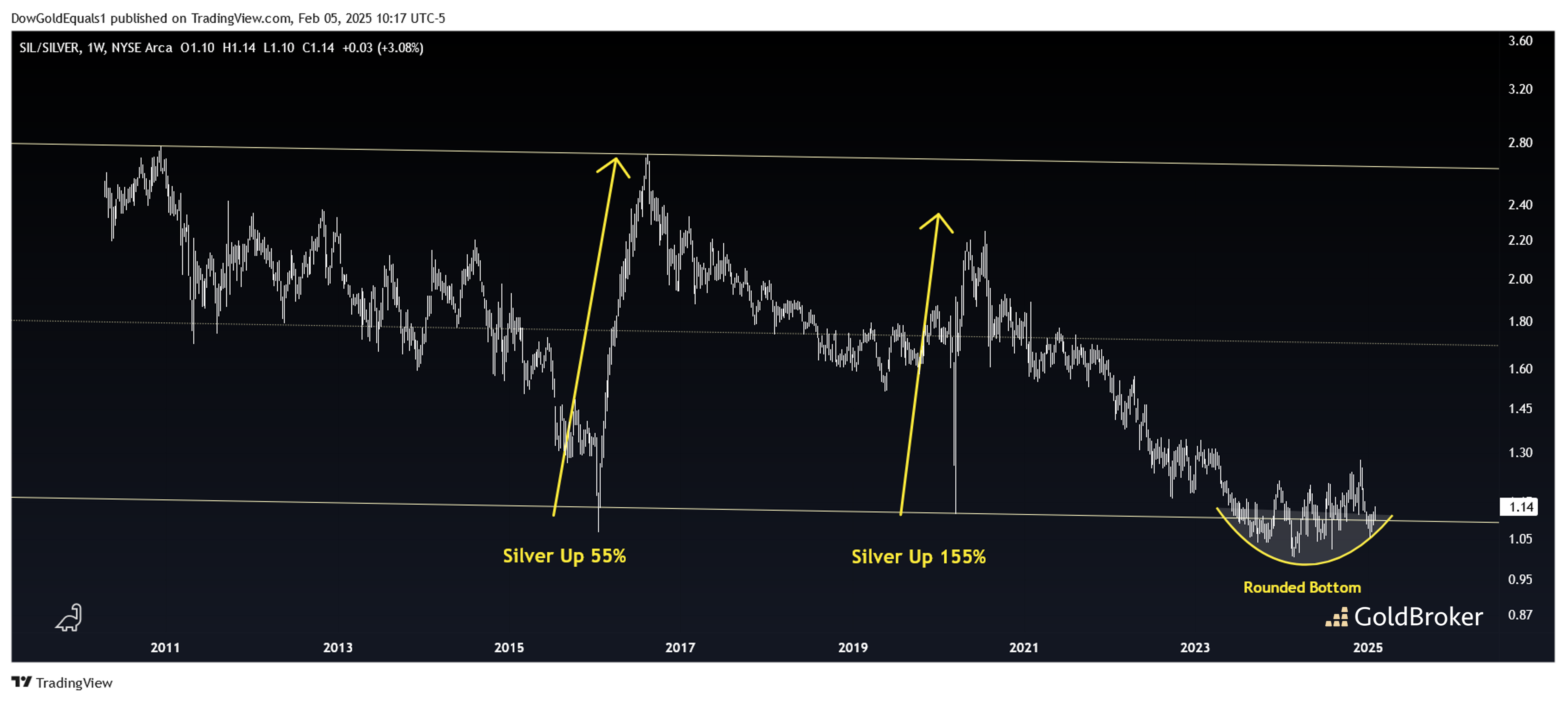
The second ratio chart is of SIL/Silver. SIL is an index of leading silver mining stocks. As we review this channel, we can readily see that silver mining stocks have vastly underperformed silver for the last 15 years. However, there have been short periods when SIL has outperformed silver, and when it has, silver too has risen dramatically. With both of those rises coming off the lower channel rail, it is interesting that the ratio now finds itself right on the lower channel again, carving out a rounded bottom. The ratio looks primed for another run off the lower rail, which history suggests could take silver to the $50 -$80 range in fairly short order.
Reproduction, in whole or in part, is authorized as long as it includes all the text hyperlinks and a link back to the original source.
The information contained in this article is for information purposes only and does not constitute investment advice or a recommendation to buy or sell.


