Written by Jan Nieuwenhuijs for The Gold Observer
Averaging stock market capitalization to GDP ratios from seventeen developed economies over the past 150 years reveals the world has never witnessed an equity bubble of the current magnitude.
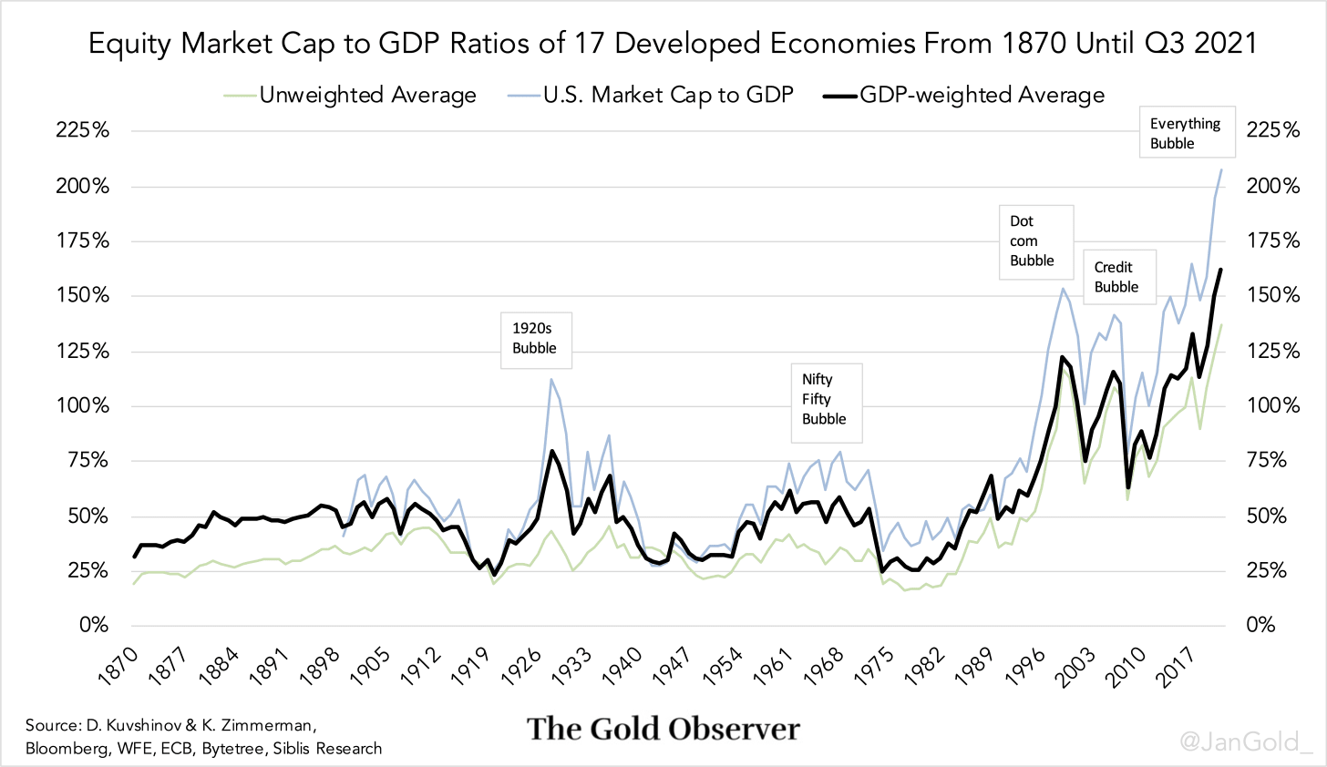
The weighted average of seventeen stock market cap to GDP ratios reached 162% at the end of the third quarter of 2021, which is the highest ever since 1870. It’s unlikely it has been higher previous to 1870, because economies were not as intertwined then. Most likely, equity bubbles were more local. In addition, before 1870 countries were commonly on a metallic standard that prevented long periods of excessive speculation.

During the dot com bubble in 2000 the weighted average of the developed world market cap to GDP ratio reached 123%, and during the credit bubble in 2008 it hit 116%. Before the 1980s it only once transcended 75%. Clearly, something drastically changed in financial markets around the 1980s.
Perhaps you wonder why I think stock markets are in a bubble, as opposed to fairly valued in a new economic paradigm. My answer is simple: if I look at stock market cap to GDP levels in the chart above, and every peak in the past 150 years was a bubble, why wouldn’t the current peak, higher than every previous peak, be a bubble?
In trying to build a long-term gold valuation model and collecting macro data from as far back as possible, I stumbled upon an academic paper from Dmitry Kuvshinov and Kaspar Zimmerman: The big bang: Stock market capitalization in the long run. Kuvshinov and Zimmerman (K&Z) did a high-level investigation to gather stock market data of seventeen developed countries* from 1870 through 2016. After these gentlemen shared their data with me, I searched for the market cap numbers from 2017 until Q3 2021 that matched the K&Z methodology (selecting only domestic ordinary shares). All the data combined is visible in the above chart.
The conclusion of the K&Z paper is that until the 1980s stock market caps in developed economies grew roughly in line with GDP. Hence, the weighted average market cap to GDP ratio hovered around 50% for 110 years. Since the 1980s, market cap growth accelerated much faster than GDP, caused by increases in stock prices, not issuance growth. According to K&Z the key reason has been a profit shift from other parts of the economy towards listed firms. And higher profit margins have mostly been aided by lower interest expenses.
From researching the exact cause why stock markets exploded in the 1980s (I think only interest expenses is not the full story) I ended up in a “rabbit hole” that I have yet to come out off. When I have finished my analysis, I will certainly publish it.
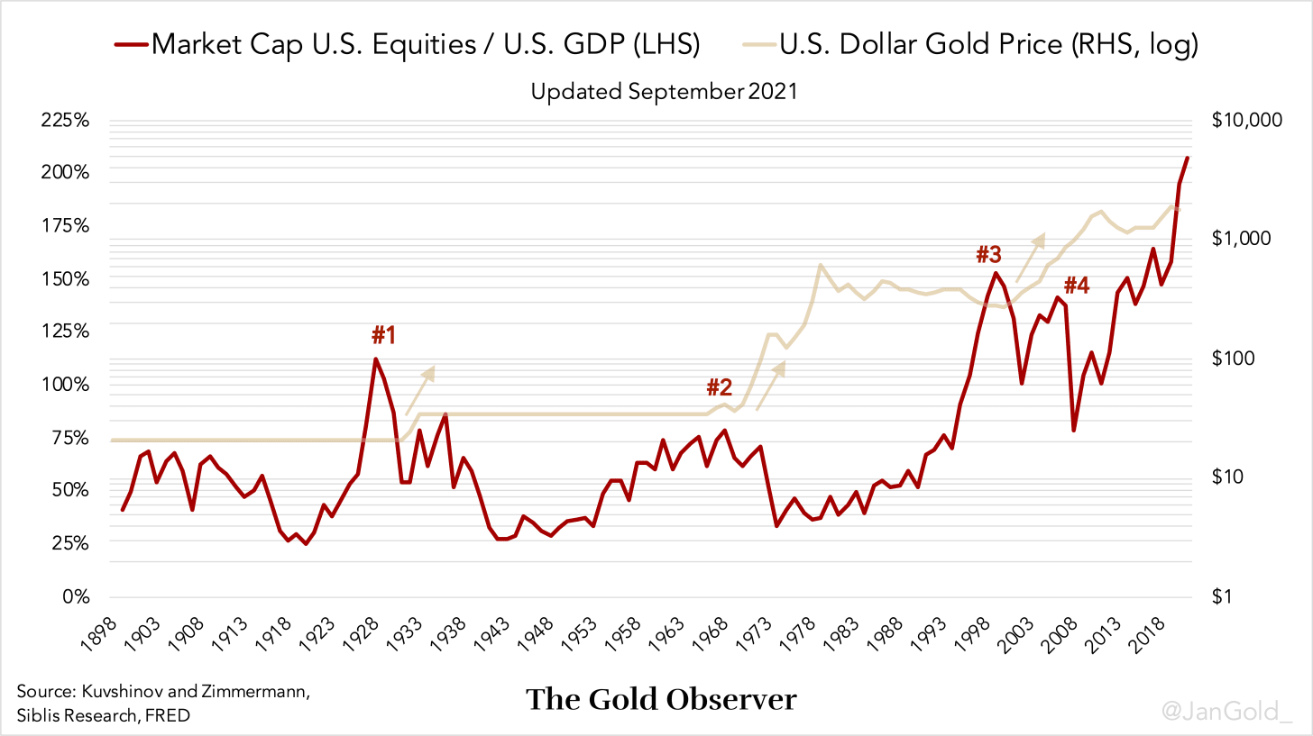
For those who missed one of my previous articles, in the United States stock market cap to GDP ratio peaks over the past 120 years have always been followed by a higher gold price. After the peak in 1929, the 1970s, 2000 and 2008 the dollar devalued against gold.

If you enjoyed reading this article please consider to support "The Gold Observer" and subscribe to the newsletter.
Reproduction, in whole or in part, is authorized as long as it includes all the text hyperlinks and a link back to the original source.
The information contained in this article is for information purposes only and does not constitute investment advice or a recommendation to buy or sell.


