The bull market in gold and silver that started in 2000 seems to have ended in 2011, and a bear market started in 2013. Was gold in a speculative bubble such as we’ve known in the ‘70s, or was it only in a cyclical bull market, itself part of a secular bull market, that would lead later (2014-2016) to a mania phase similar to the one in the ‘70s? With the help of Nick Laird’s excellent charts (www.Sharelynx.com)², let’s take a closer look at the characteristics of both periods.
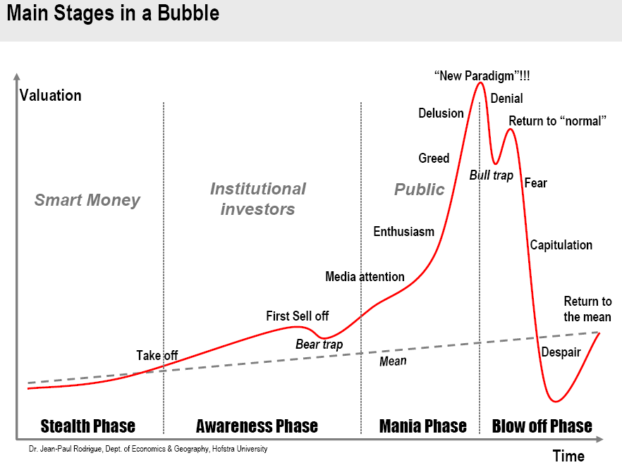
First, we have to define what constitutes a speculative bubble. Didier Sornette, from the Swiss Federal Institute of Technology, has been studying speculative bubbles for a long time, and trying to predict their unfoldings. According to Didier Sornette, “The standard view of a bubble is that it involves explosive exponential growth of a price... When growth is plotted on a log scale, exponential growth looks linear... What I look for is the process by which the rate of return accelerates in a way that is super-exponential because of positive feedbacks. ”¹. Which entails a parabolic rise in price not only on an arithmetic chart, but also on a logarithmic one. We can see this rise in gold in the ‘70s (chart #5). What we can observe is not only a rise in price, but also an acceleration of the rise in price. Chart #1 shows a model of a typical speculative bubble along with its different phases.
Chart #1: Main Stages in a Bubble
Stealth phase – Awareness phase – Mania phase – Blow off phase
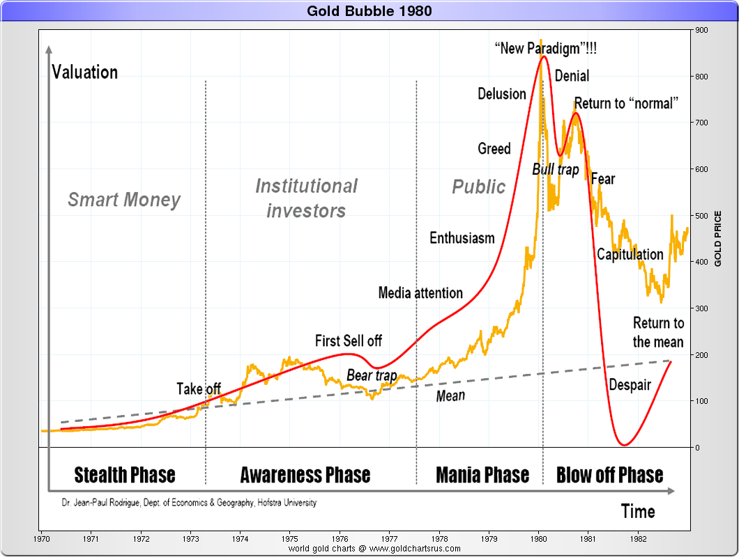
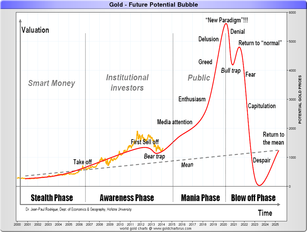
By superimposing on this model the bull markets of the ‘70s and 2000 (chart #2 and #3), we see that the ‘70s bull market fits the speculative bubble model perfectly, whereas the 2000 bull market only fits with its first two phases, stealth and awareness. The present bear market would only constitute a « bear trap » indicating the end of the awareness phase. Having personally lived through the speculative gold bubble of the ‘70s, I can assure you that the euphoria I witnessed then hasn’t been seen anywhere during the recent rise in the years 2000.
Chart #2: Gold bubble of the ‘70
Chart #3: ‘2000s potential bubble
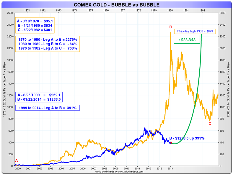
During the ‘70s speculative bubble, gold rose by 2,276%, whereas, since 2000, the rise in price has only been of 391%. For the 2000 bull market to be almost similar to the ‘70s one, it would still need to rise by 1,881%, or reach a price of approximately 23,348 dollars (chart #4).
Chart #4: Gold (COMEX) – Gold ‘70s bubble vs 2000 bubble
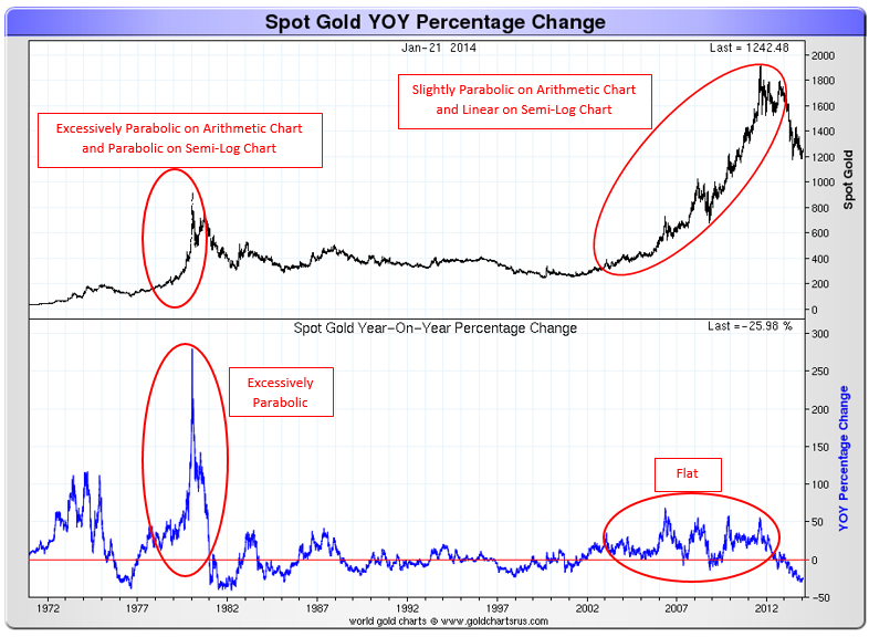
When we look at chart #5, it is hard not to notice the difference in the acceleration of the rise in gold’s price (annual rate of change) between 1970 and 2000. The acceleration is exploding in a parabolic manner in the ‘70s, whereas it almost seems flat starting in 2000.
Chart #5: Gold Price vs Gold YOY Percentage Change
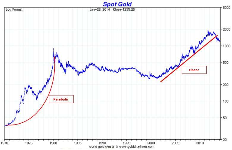
Chart #6 (semi-log) shows the big difference between the two bull markets very well. Whereas the ‘70s bull market is parabolic on both charts (arithmetic and semi-log), the 2000 one is slightly parabolic only on the arithmetic chart.
Chart #6: Gold Price (semi-log)
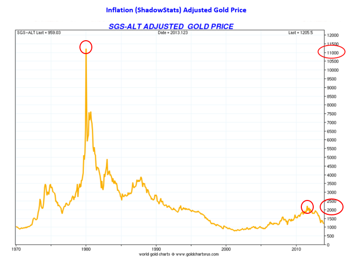
Let’s now observe, in the next two charts, the difference between both markets in real terms (adjusted for inflation). Chart #7 shows the price of gold adjusted for the CPI (the official measure), whereas chart #8 shows the price of gold adjusted with the ShadowStats index (SGS). ShadowStats calculates inflation the way it was done before the U.S. government brought modifications to its CPI in 1990, said modifications underestimating inflation. In both cases, we can see that the price of gold did not go higher than the 1980 peak, whereas in nominal value it reached twice the value of 1980.
Chart #7: Gold Price Adjusted for Inflation (official)
Chart #8: Gold Price Adjusted for Inflation (ShadowStats)
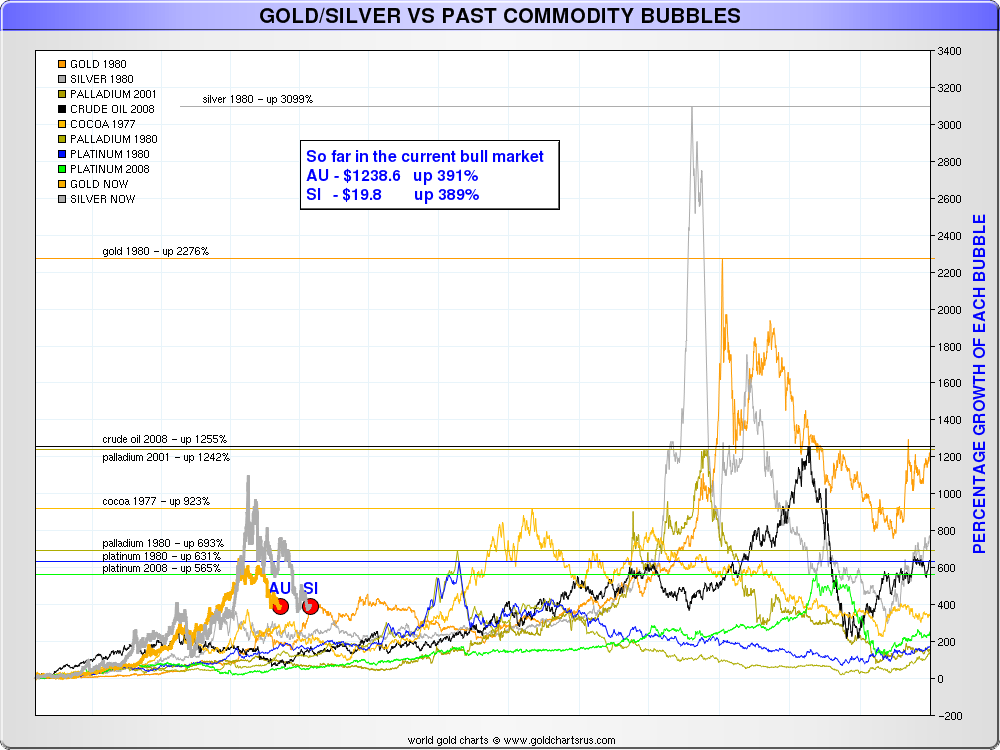
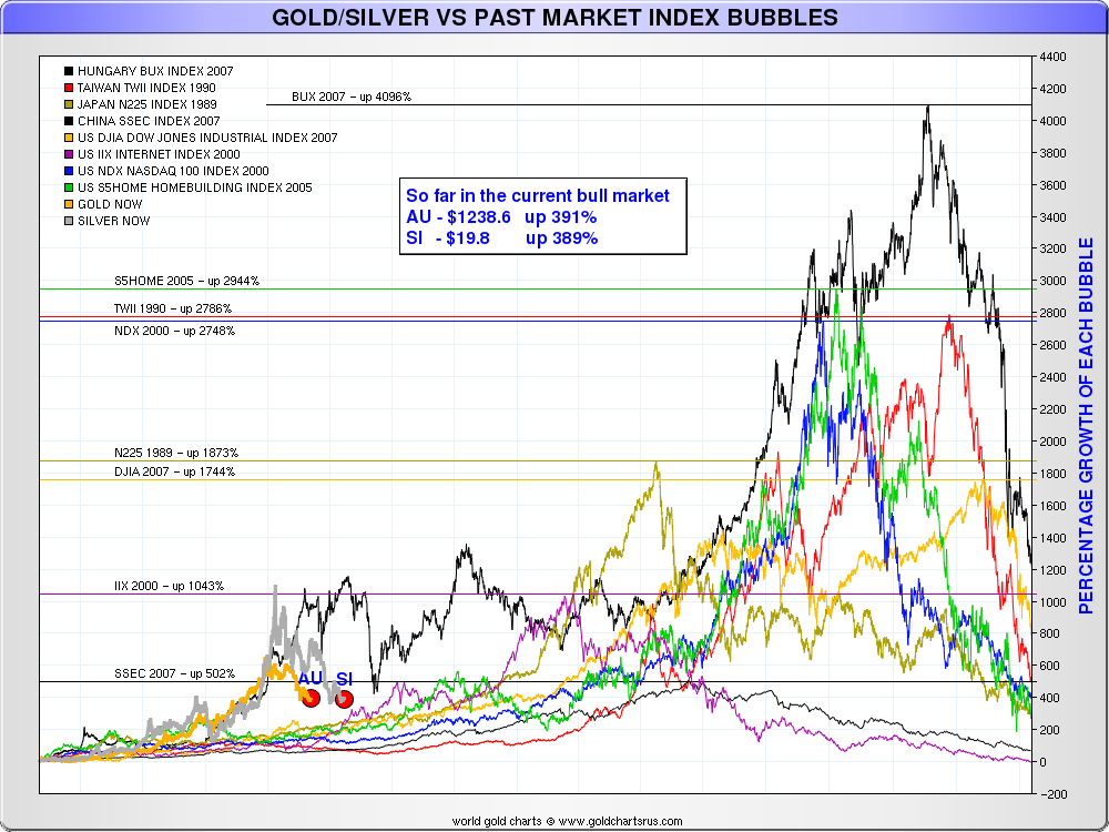
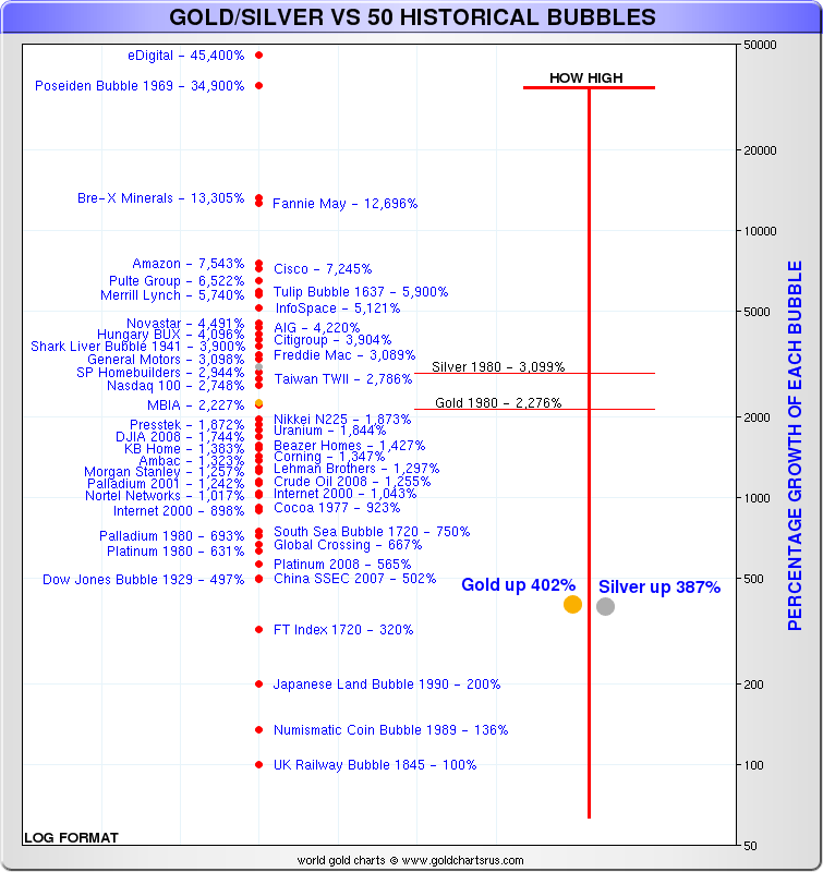
It is also interesting to compare the ‘70s gold speculative bubble and the 2000 bull market with other historical speculative bubbles. The greatest bubble in history is the dot.com bubble with eDigital, in 2000, reaching 45,400% (chart#11). The following two graphs compare the bull market in gold and silver since 2000 with the main speculative bubbles in commodity markets (#9) and financial markets (#10). During the speculative bubble of the ‘70s, gold rose by 2,276% and silver by 3,099%, whereas gold has risen by only 391% and silver by 389% since 2000.
Chart #9: Gold and Silver vs Historical Speculative Bubbles in Commodity Markets
Chart #10: Gold and Silver vs Historical Speculative Bubbles in Financial Markets
As of today, none of the causes of the monetary crisis at the base of the recent rise in gold has been resolved. Even if a bull market doesn’t necessarily end in a speculative bubble, history shows that it’s usually the case with monetary metals (gold and silver). I believe an international monetary crisis cannot be avoided and I am convinced that gold, and also silver, will end their bull markets with a speculative bubble that will push the price of gold well above 5,000 dollars an ounce and maybe even above 10,000 dollars.
Let me conclude by saying that I am convinced that the 2000 bull market is far from over, and that we are only at the end of the second phase of a speculative bubble. We are at the end of a correction in the awareness phase, called a “bear trap” (chart #1). I believe the mania phase will start this year, right after we reach the psychological level of 2,000 dollars an ounce of gold.
This analysis can be applied to silver as well, because both metals are almost perfectly correlated, but with silver there is much more volatility.
Chart #11 : Gold and Silver vs 50 Historical Speculative Bubbles
Sources:
• 1 Perspectives, January 2014, Pictet
• 2 Nick Laird, www.Sharelynx.com
Reproduction, in whole or in part, is authorized as long as it includes all the text hyperlinks and a link back to the original source.
The information contained in this article is for information purposes only and does not constitute investment advice or a recommendation to buy or sell.
