This week we will look at the performance of gold compared to the United States financial sector. When this relationship is rising, it can be said that investors are showing a preference for hard money. When it is falling, investors are showing more confidence in the paper money system.
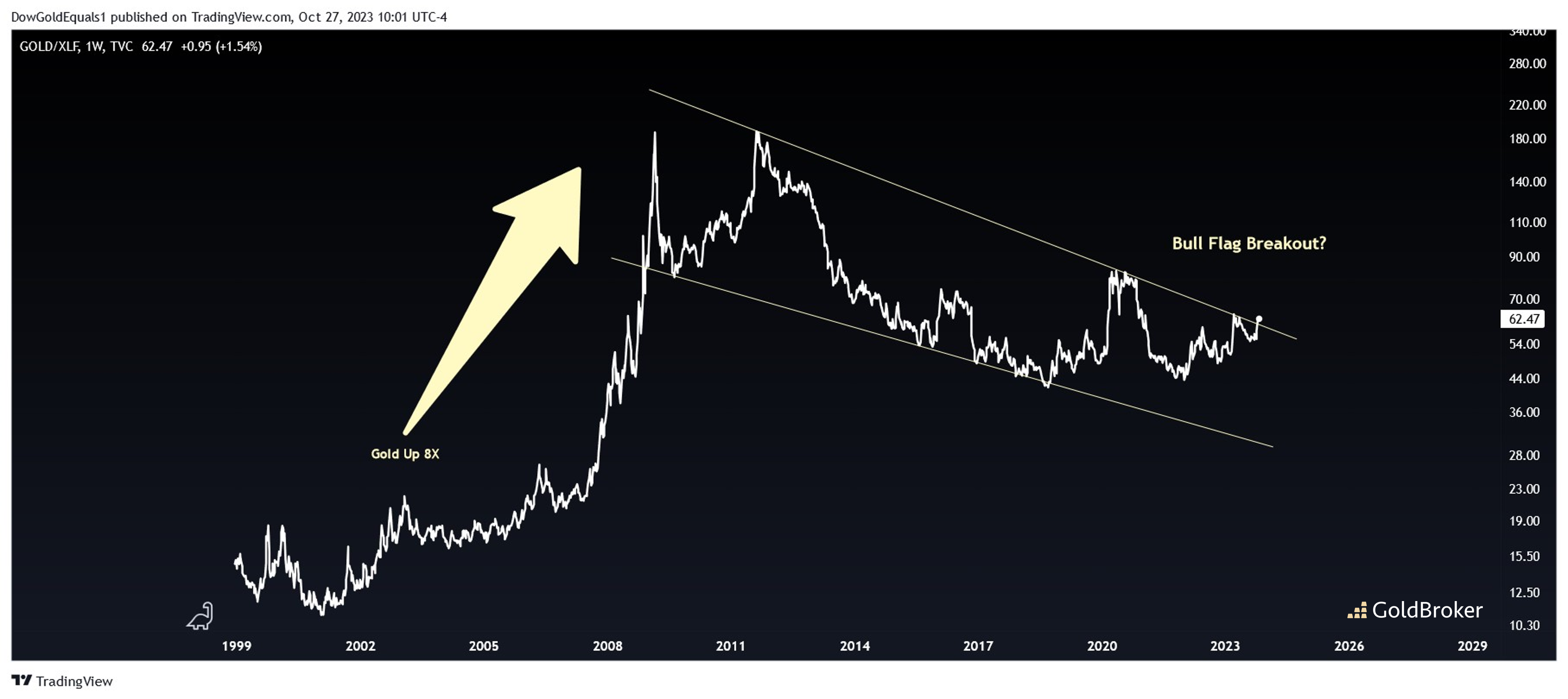
The first chart we'll review is gold vs. XLF - an ETF that invests in top US Banks. What we see is a very large, compelling bull flag that began to take shape during the Global Financial Crisis when gold simultaneously made an historic bull run between 2008-2011. A line chart is ideal for spotting breakouts early, and it's possible that we've been getting that bull flag breakout over the past couple of weeks. Note that when gold significantly outperformed XLF between 2001 and 2011, gold itself rose about 8X!
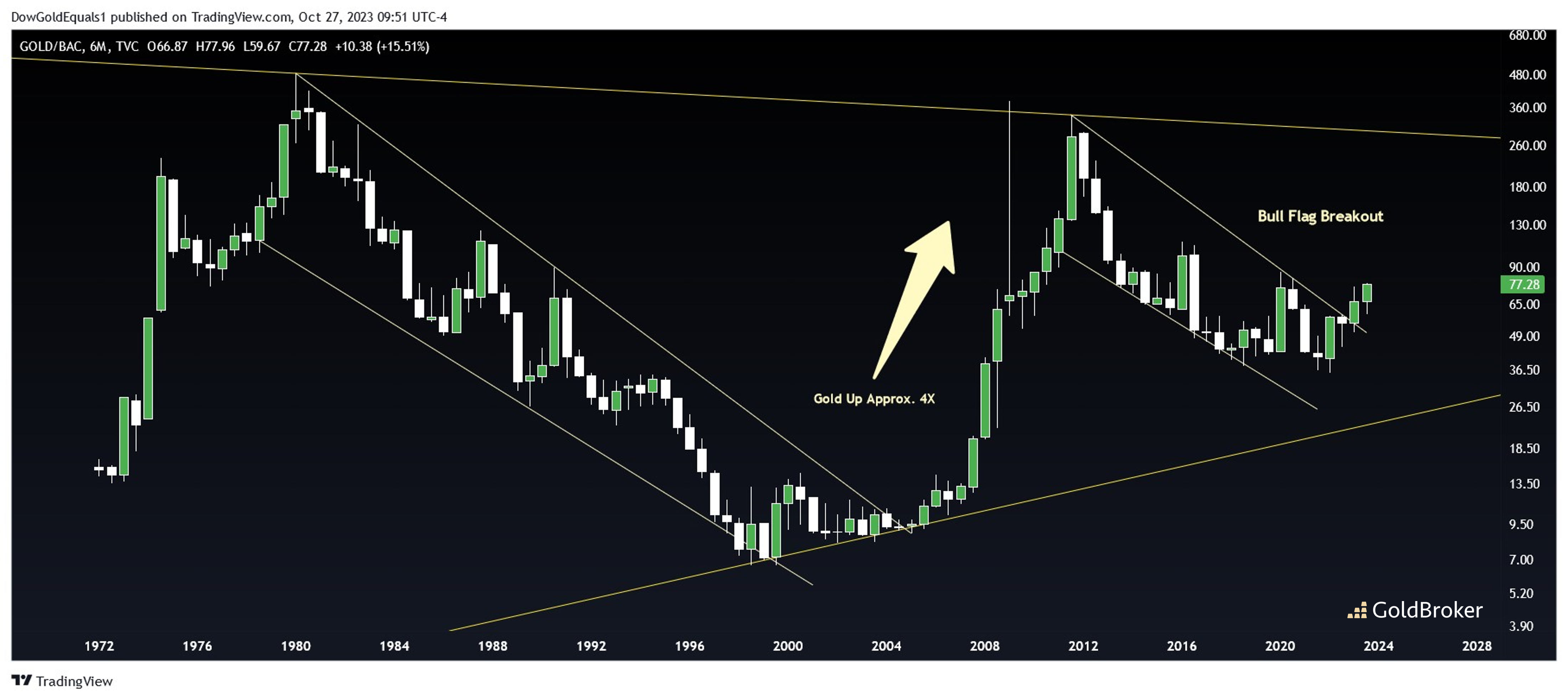
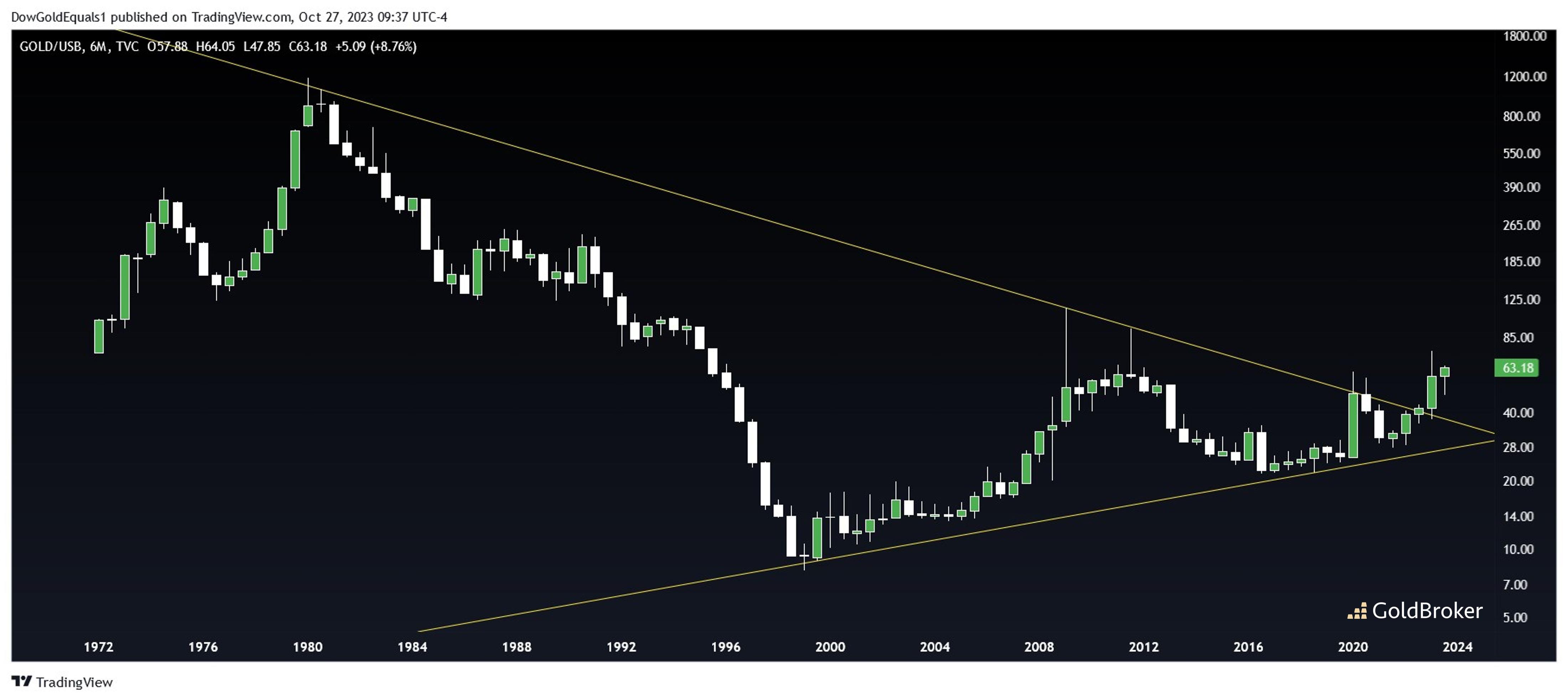
The two charts look at gold against individual banks - U.S. Bankcorp and Bank of America. Gold/BAC shows that a significant bull flag breakout has already occured. Will this breakout be as significant as the one that occured in 2004 that sent gold price up another 4X? Gold/USB is also a very interesting chart. U.S. Bankcorp is one of the top 10 largest US Banks, so a breakout of a pennant that dates back 50 years is truly something to behold!
Reproduction, in whole or in part, is authorized as long as it includes all the text hyperlinks and a link back to the original source.
The information contained in this article is for information purposes only and does not constitute investment advice or a recommendation to buy or sell.


