The consumer prices index (CPI) published Wednesday in the United States is a shock for the last of the faithful believers still clinging to the myth of ‘transitory’ inflation. The index has risen by +6.2% on last year. That is even more than the +5.8% expected. An enormous figure.
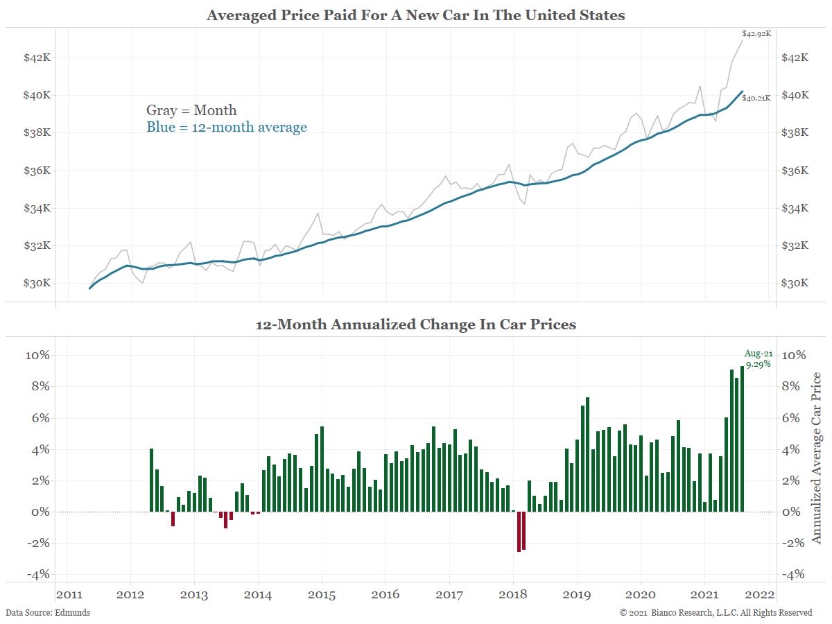
The rise in prices seen on commodities is spreading, as expected, to consumer goods. The latest illustration of this: the average price of new cars has risen above $40 000 in the United States for the first time. The rise in inflation has accelerated in the last few weeks:
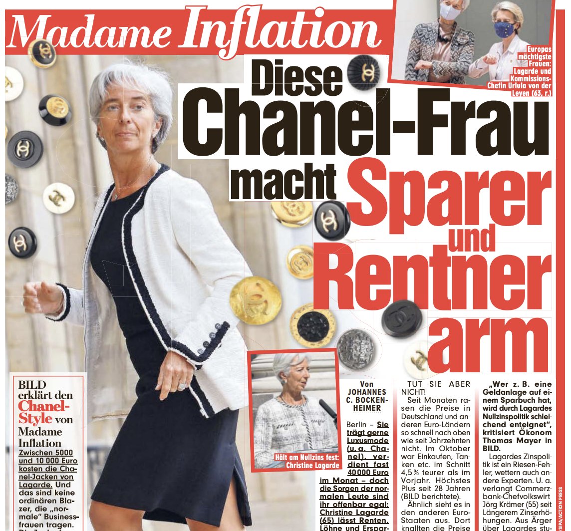
In Europe, the inflationary phenomenon is now taking up a lot of column inches in the press. In Germany, things have reached the point where the chairman of the BCE has been put under the spotlight by the newspaper Bild (which has the largest circulation of all the German papers), which ran the headline: “Madame Inflation. This woman wearing Chanel is making savers and pensioners poorer.”
The wind has definitely turned. The inflation has set in, and the thing that was contributing financially towards limiting the rise in prices has suddenly vanished. The factors at the origins of the deflationary pressure in recent years have brutally reversed.
The globalization of transactions has hit the wall due to supply chain bottlenecks. It used to be cheaper to manufacture things elsewhere, but the outsourcing of production is now leading to additional costs...
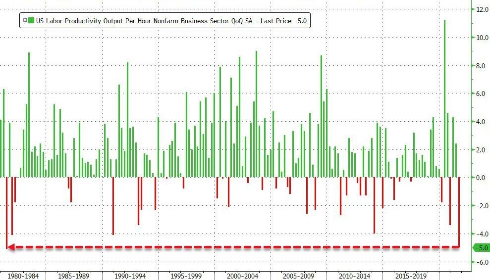
Another economic factor is also seeing a turnaround: productivity. It has just taken a backwards leap that is without precedent in the last 40 years. The gains in productivity were the very thing that had hitherto managed to limit the rise in prices...the collapse in productivity, by contrast, is accelerating the inflation.
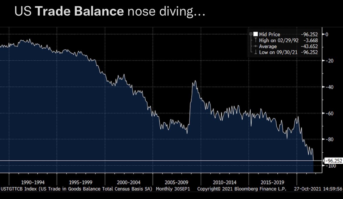
Whereas U.S. productivity is nose-diving, the rise in consumption is being confirmed in the United States, where the levels of bank credit are skyrocketing once again, following the end of the government’s support plans. Consumption was sustained by the checks handed out by the State, and it is now credit cards that are taking up the baton. The U.S. trade balance, as one would very rationally expect, is falling once again...
America's economic engine is over-heated. Against this backdrop, the U.S. Stock Exchange is reaching new highs.
Let us try, this week, to get some perspective on the situation by examining a number of charts. The next part of this article is going to concern itself with a technical analysis. It is important, today, to take a look at where we are in terms of cycles.
Let us consider, first of all, the SP500 index, which brings together the 500 biggest capitalizations listed on the New York Stock Exchange.
The SP500 is once again in the overbought zone, resulting in three very distinct bullish drives:

The technology stocks are also in the overbought zone.
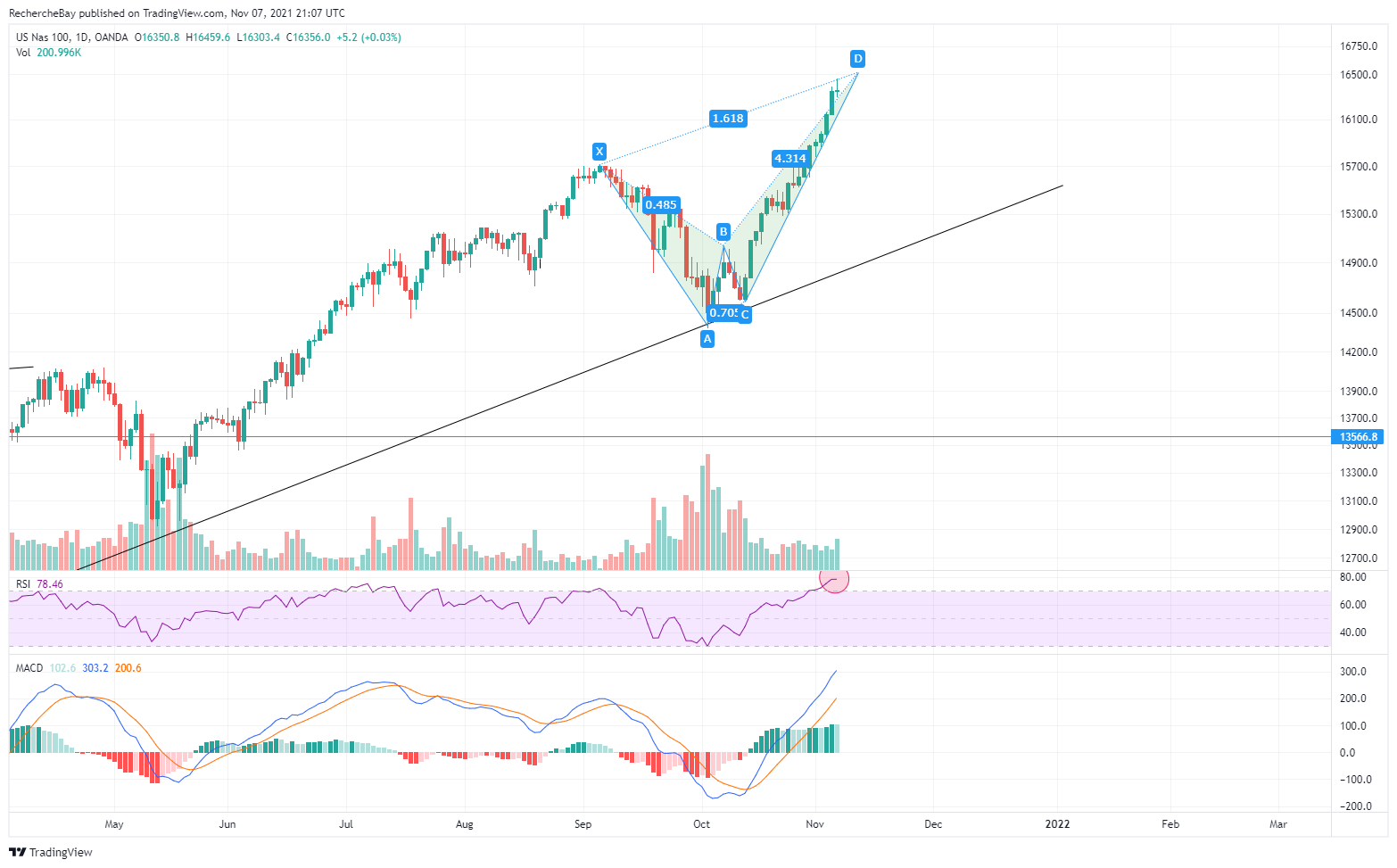
The Nasdaq is even more exposed to a short-term correction. The index of the 100 biggest technological capitalizations is in the process of sketching a bearish ‘Crab’ harmonious pattern, whose latest upward leg has just been completed.
While the stock market indices are finishing the bearish cycles, precious metals are in a phase of significant turnaround.
Precious metals are at a major turning point on the charts in relation to the indices.
Silver is on a long-term support in relation to the indices:

As for gold, it is attempting to extricate itself from its consolidation triangle, which appears to be concluding bullishly...
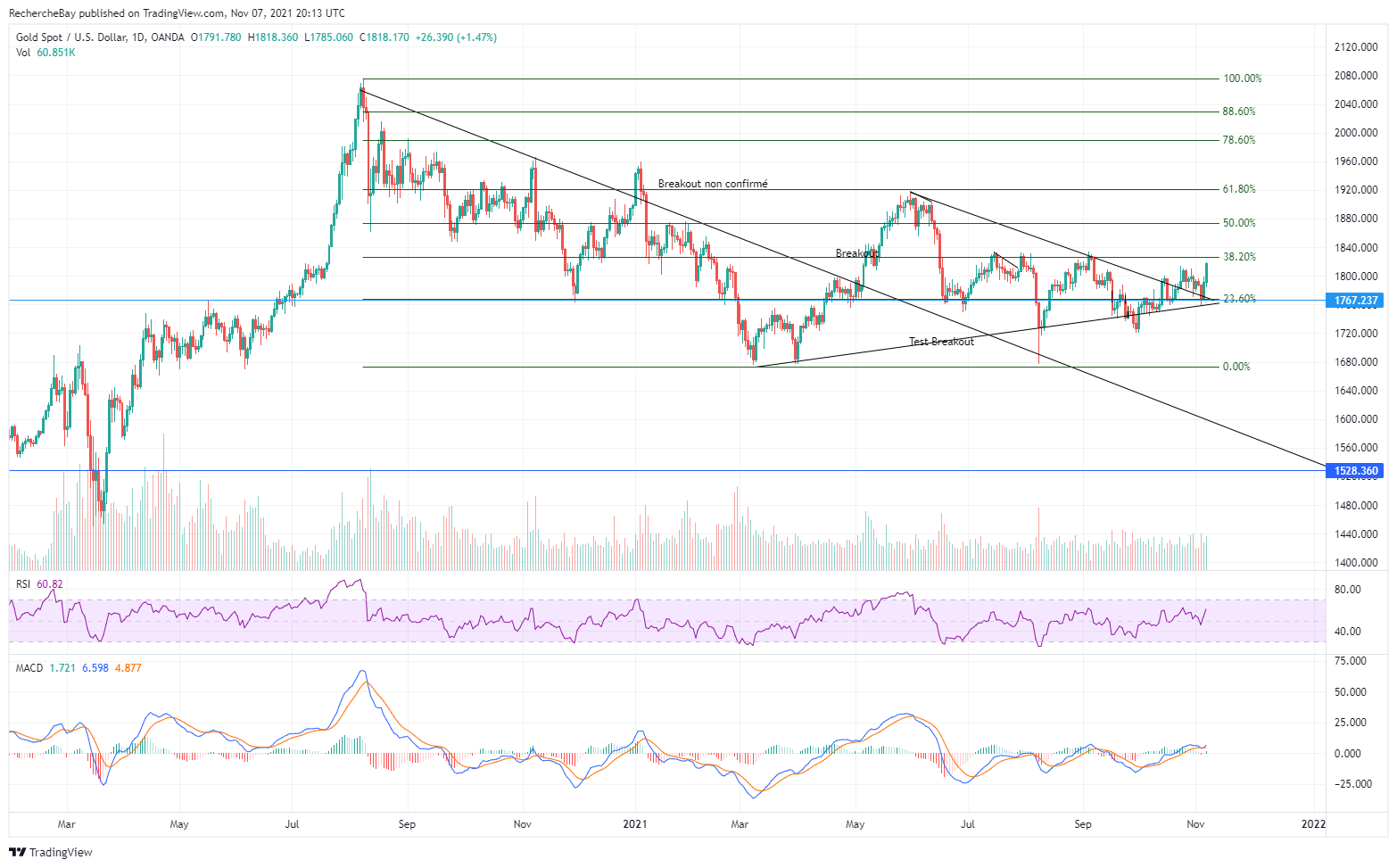
For the time being, no breakout has been confirmed for gold in dollars… In contrast, gold in euros is already in a breakout stage:
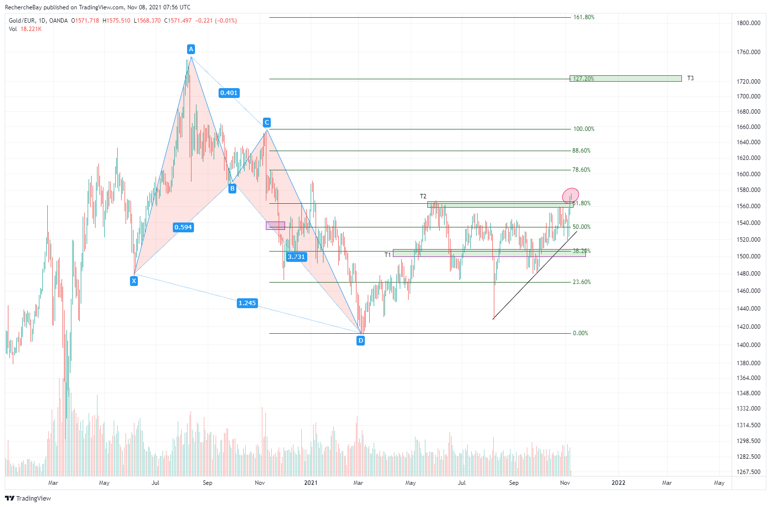
The two targets of the bullish ‘Butterfly’ harmonious pattern from March 2021 have already been reached, and the second target (which corresponds to the Fibonacci retracement of 61.8% of the last downward leg of the harmonious pattern) was the bullish resistance throughout the entire summer. This resistance level is currently breached. The Butterfly’s third target is far higher, at around €1 720...
Let us now study one of my favorite indicators, namely the Gold/Copper chart.
If we look at this chart over the long term, we note that this Gold/Copper pairing is a fairly reliable indicator as to the steering effects of the Fed’s monetary policies, since its first interventions in 2008. When gold rises in relation to copper, the Fed is ‘challenged’ and the risk increases. When it falls, expectations of a bounce-back in activity rise; ‘Doctor Copper’ signals brighter times ahead for economic activity and these immediate expectations exceed the risks of a monetary crisis (the ‘full’ confidence phase).

The first intervention by the Fed (Quantitative Easing 1 or QE1) corresponds to the end of the breakneck rise of gold in relation to copper in 2008. The Fed intervened directly on the markets to ward off any risk of systemic collapse. Since then, this intervention has contributed toward rescuing the financial system as a whole; the risk has not stopped reappearing continuously. Each time, the Fed has had to launch a program of asset purchasing to avoid seeing this risk being transformed into the collapse of the financial system. That is exactly what this chart shows us: each program (QE1, QE2, QE3, QE4, QE5, etc.) corresponds to the rise in the Gold/Copper ratio being stopped in its tracks. When the Fed professes to be reducing these programs, the Gold/Copper chart rises again. Without an intervention from the Fed, the risk starts to rise again.
We are at a moment right now where the Fed has just indicated that it will gradually be bringing its latest program to an end. It therefore makes sense that our chart is in the process of turning upward again.
The bullish pressure on gold is back, and the amount of effort required to contain this surge, on the futures markets, is increasingly large. Almost 60 000 short futures contracts were added in the last two days to defend the short positions recently opened and to defend at all costs the breakout line, at $1 835: all the same, that represents the equivalent of almost 200 tonnes of paper gold sold in a few hours...
How many ‘naked shorts’ are going to have to be used again, if gold breaks this resistance level? It looks as though this little game is going to continue to work for as long as the futures market is operational. The problem: in order for this derivatives market to function, there needs to be some inventories, so that one can at least prove that it will be possible to honor a demand for delivery. The more the available inventories for these markets are diminished, the greater the risk of rupture, and the more volatile these markets become.
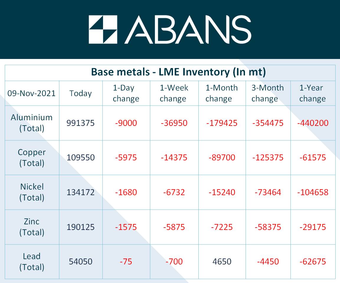
The current LME inventory indicate to us that the futures markets are going to be far more volatile from now on, because the weakness of the underlying physical inventories is increasing the leverage effect, and therefore the volatility, of these markets. The inventories are diminishing before our very eyes, for all the metals:
For physical silver, the depleting of the inventories is happening even more quickly.
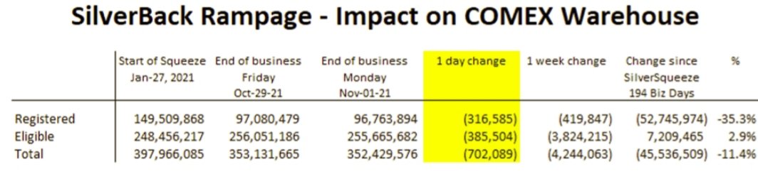
Here is the inventory published last week:
And here is the current inventory, 4 days later:
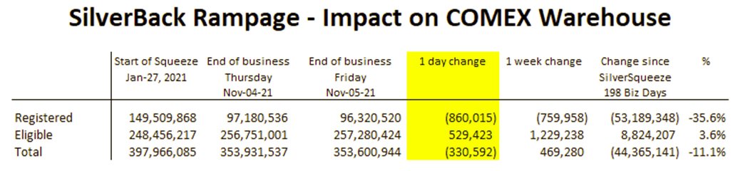
From the moment the Silver Short Squeeze started, it took 9 months for a third of the reserves to be drained. The reduction of inventories is accelerating. The next year is going to be tense on the silver market, and it may be that the market anticipates this tension fairly quickly.
Under these circumstances, the short positions opened recently on precious metals are creating enormous potential for a short squeeze in the sector.
Original source: Recherche Bay
Reproduction, in whole or in part, is authorized as long as it includes all the text hyperlinks and a link back to the original source.
The information contained in this article is for information purposes only and does not constitute investment advice or a recommendation to buy or sell.


