Mike Roy’s article published on GoldBroker.com became viral in a few days.
In this analysis, the author presents several dizzying chart configurations.
As noted by Mike Roy, the logarithmic gold chart is breaking through a resistance that has held since 1981:
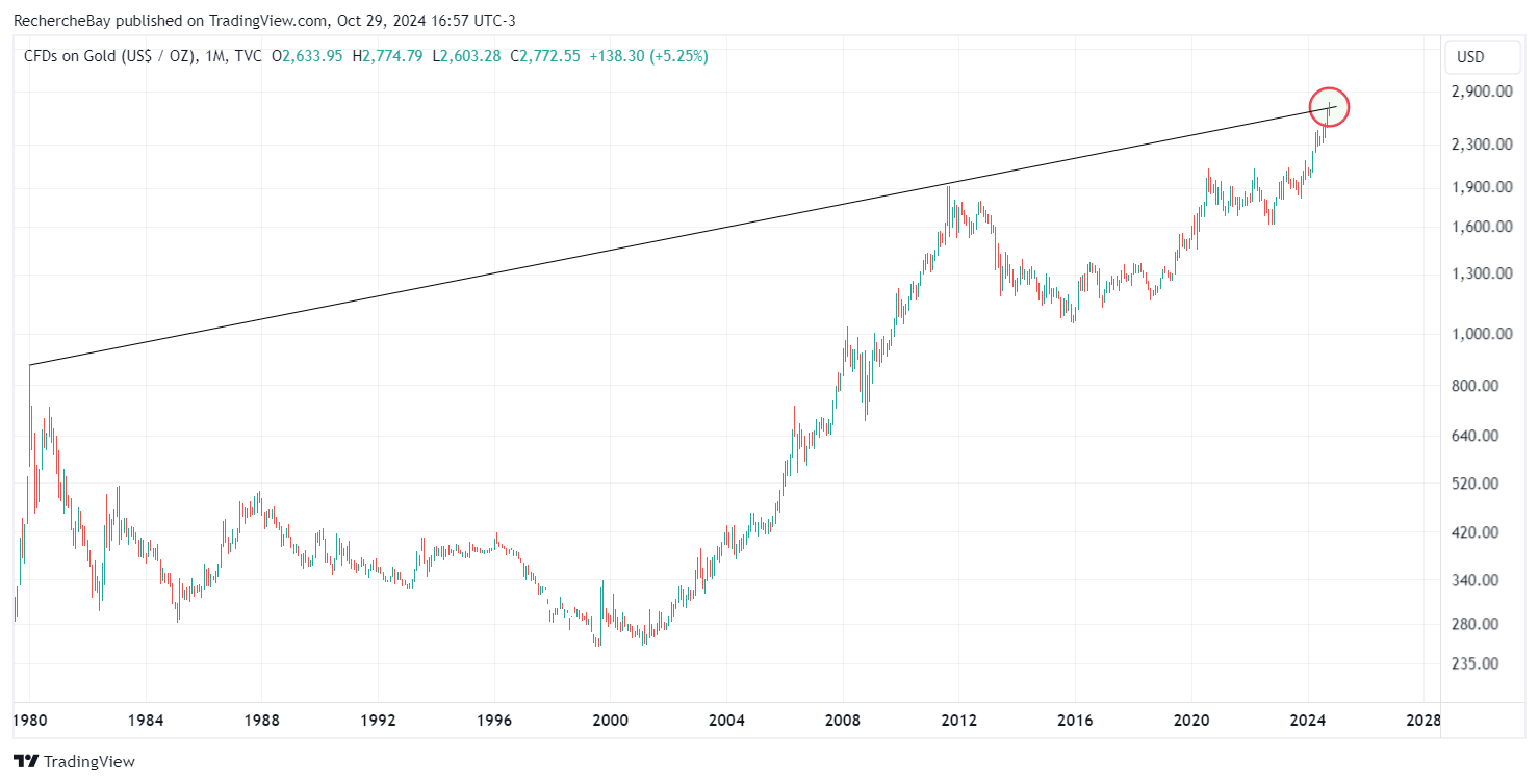
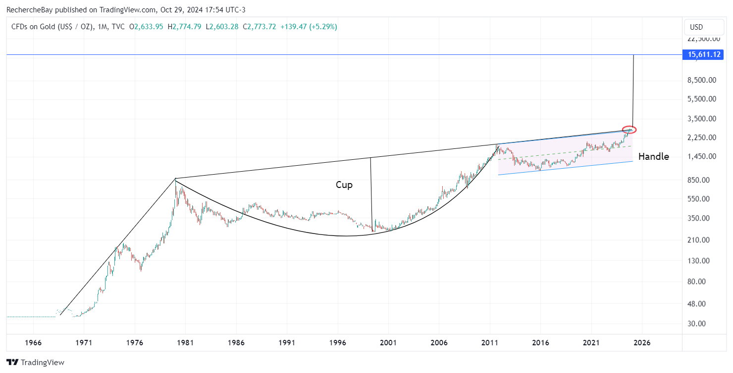
This chart reveals a cup-and-handle configuration that took 44 years to form. The cup formed between 1980 and 2011, while the handle developed between 2011 and 2024, thus respecting an appropriate time ratio to validate this technical pattern.
What if gold were to break through this huge technical pattern?
If so, the upside objective after the breakout of this pattern would not be $10,000, as Mike Roy indicates, but rather $15,000. This level corresponds to the depth of the cup, projected from the breakout in logarithmic scale:
Let's take a look at the gold chart in monthly variations:
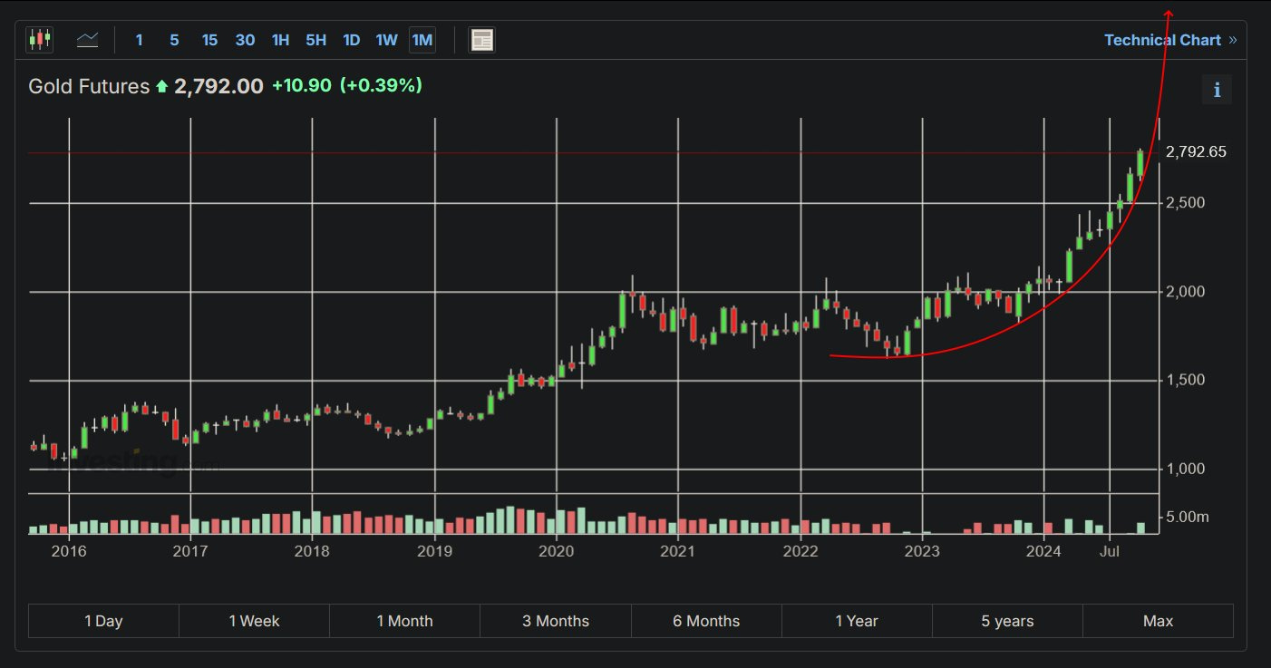
This chart is equally dizzying.
Since its breakout from the $2,000 mark, gold has been progressing in a parabolic fashion.
If this parabolic trend continues, gold should reach $3,000 by the end of November.
Gold's ascent is impressive; it's the very nature of the parabola: the more time passes, the steeper the slope becomes.
Gold is progressing parabolically, with relative indifference.
The main reason for this silence is that gold is rising along with the markets. More precisely, gold has yet to take off relative to technology stocks.
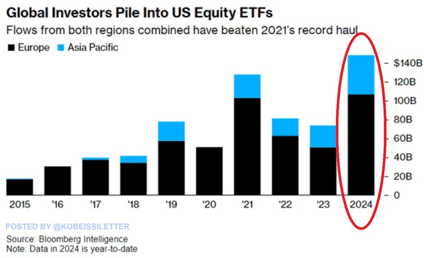
Investors around the world are moving into US equities at an unprecedented pace: flows into US ETFs reached $145 billion this year, surpassing the previous record of 2021 by $10 billion and doubling last year's total.
The majority of these investments came from Europe ($105 billion), followed by the Asia-Pacific region ($40 billion).
For many, US equities are now perceived as a “safe haven” in the face of economic uncertainty:
The Gold/Nasdaq chart has still not broken its downtrend line:
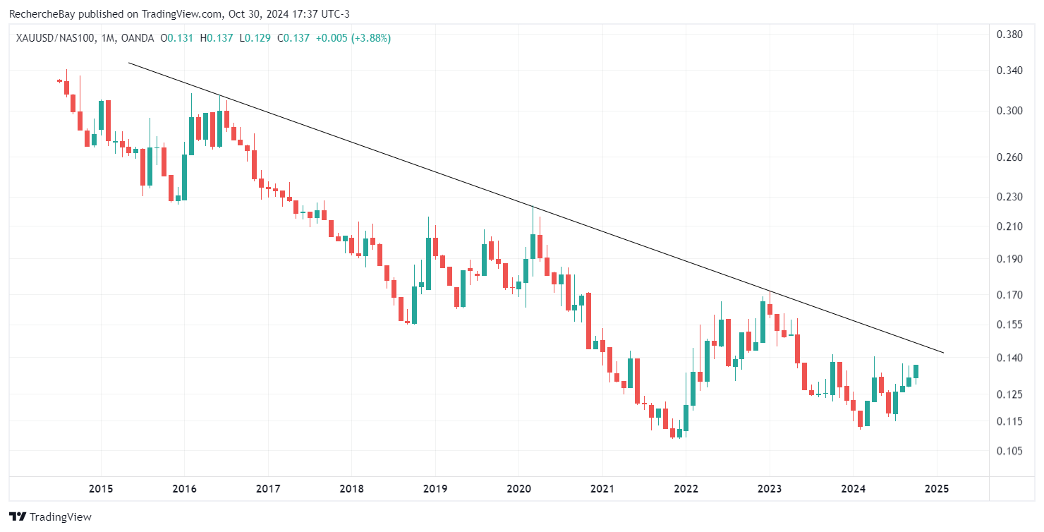
Until this line is breached, gold's advance will remain in the shadows.
The moment this line is crossed to the upside will probably mark the beginning of increased interest in gold. If it continues on a parabolic trajectory, the attention paid to the yellow metal could become particularly intense!
This parabolic ascent is all the more impressive in that it is accelerating at the same time as US interest rates are rising.
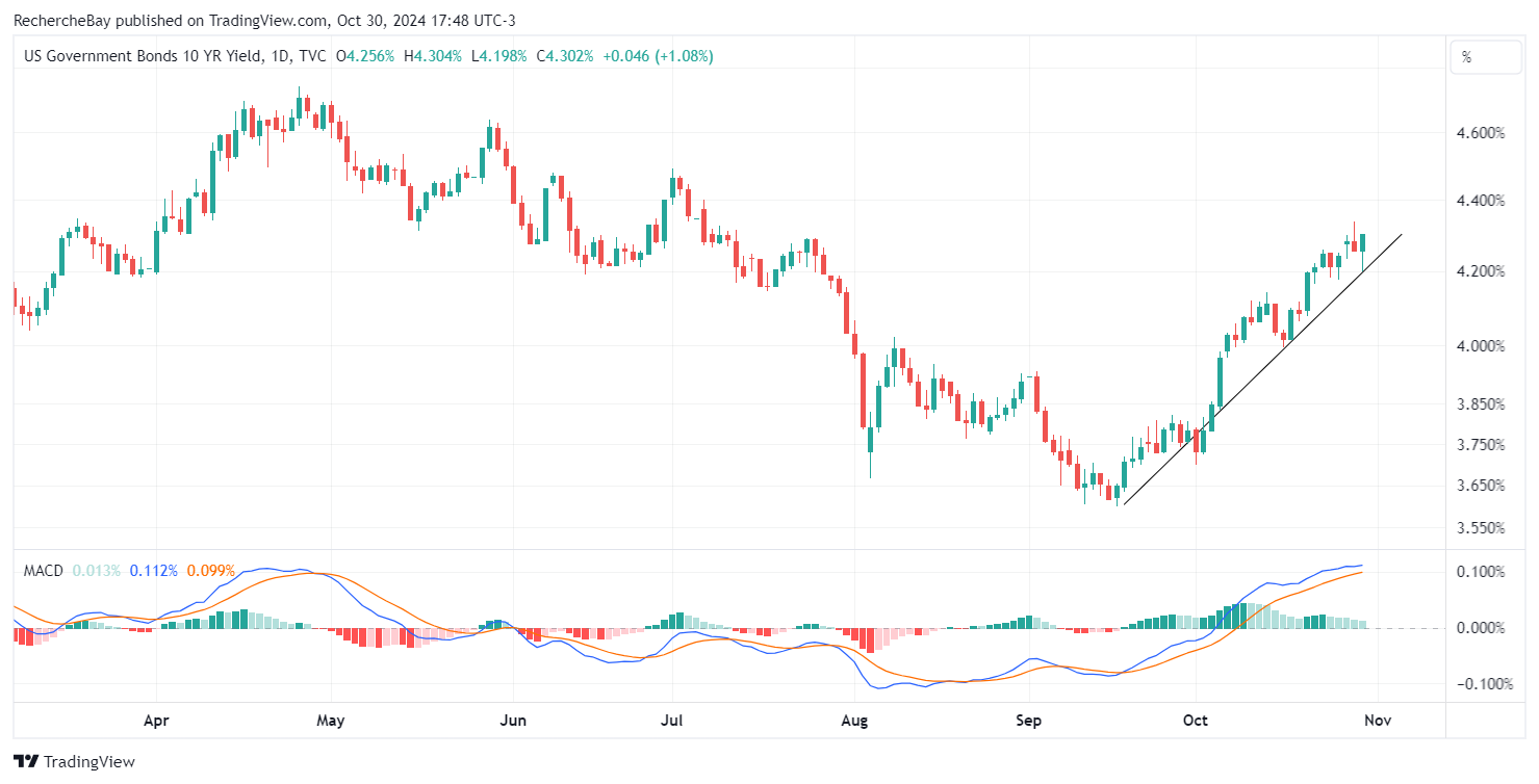
Interest rates have literally risen in a straight line since the Fed cut rates by 50 points at its last meeting in September.
The yield on 10-year bonds has climbed 60 basis points in the month since the Fed began cutting rates.
For the first time since July, the yield on 10-year bonds has exceeded 4.30%:
The average 30-year mortgage rate rose above 7.0% again for the first time since July:
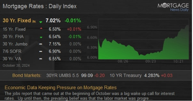
The Fed has cut rates by 50 basis points, but so far this has proved to be a resounding failure: rates are rising, once again threatening the bond market and real estate.
A few Nasdaq stocks are playing the role of safe havens, while the price of gold is still climbing silently and parabolically.
There's definitely something wrong with this market!
Reproduction, in whole or in part, is authorized as long as it includes all the text hyperlinks and a link back to the original source.
The information contained in this article is for information purposes only and does not constitute investment advice or a recommendation to buy or sell.


